
Leigh's Exclusive Boutique - Logo

The Pearl Suite - Logo
Olla Kalla Jewelry - Logo
Bully the Builder - Logo
Active Hoops - Logos
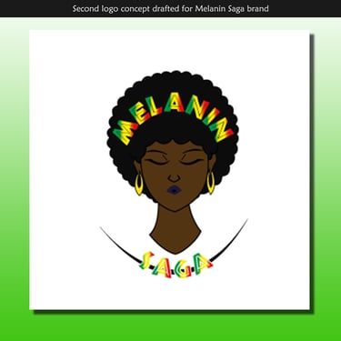
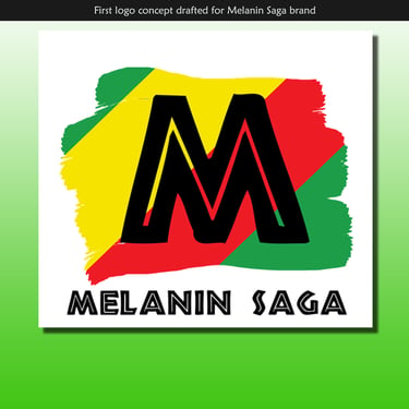
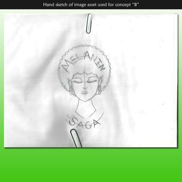
Melanin Saga - Logo
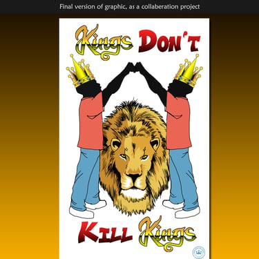
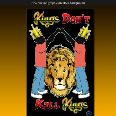
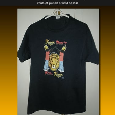
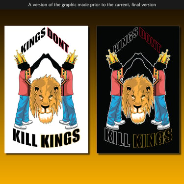
Kings Don't Kill Kings - Apparel graphic
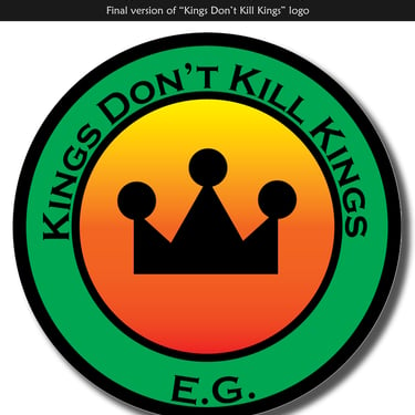
Kings Don't Kill Kings - Logo
Client Designs
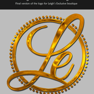
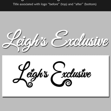
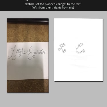
The client need a revised version of her logo for her brand. She tasked me with updating the look of the logo. She mentioned directly she wanted it to be gold in appearance. Gold is a common symbol of luxury, which is the image she wanted her brand associated with.
I didn't get a clean file of her original logo I could work with, nor did I have the font files to match the "L" and "E" to achieve the final result depicted here, so I essentially had to make logo from scratch, tracing over the original image. Fortunately, this allowed me to apply the gold chrome effect which she loved.
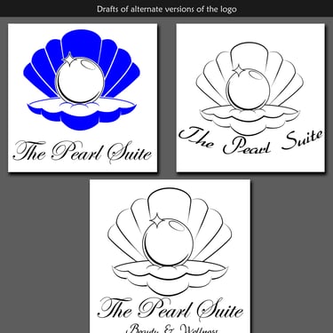
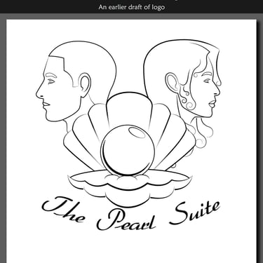
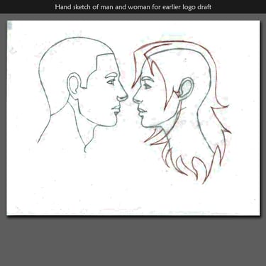
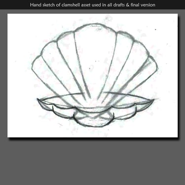
My client here, shared with me her plan to do health and wellness- to create a spa. She wanted a logo for this, so she contracted me for this. She mentioned she wanted a pearl in a clamshell. She also the image of a man and woman to accompany this. I created these assets separately, and then combined them. My client then decided that it was best to just use the shell and pearl without the man and woman.
The colors she wanted were white, blue and gold to be used in some fashion. After a bit of experimenting with drafts, it was ultimately decided to use blue for the shell, white for the pearl and the "sparkle" on the pearl to be gold. The script style font was chosen to complement the logo and give the overall logo a sense of luxury.
My client who owns a small jewelry business, needed a logo. She wanted something to help her business look like a serious, professional jeweler. She's is also very fond of her Greek heritage and wanted that incorporated into her logo. She did share a sample of what a previous designer was working on in regards to this. We used this as a starting point, so I had an idea of how to begin.
Her jewelry is hand-made (by her) and some of her products use crystals I didn't typically see in jewelry. I used that as a concept for two of the drafts I made. Ultimately, the client chose a slightly altered version of the second draft. The "curls" I placed on the bottom of the curvature of the logo, I was inspired to do based on the curving lines and shape of a bangle.
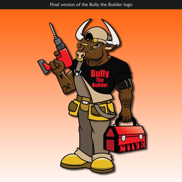
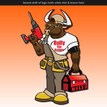
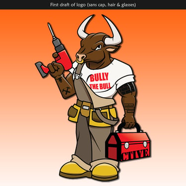
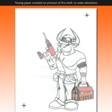
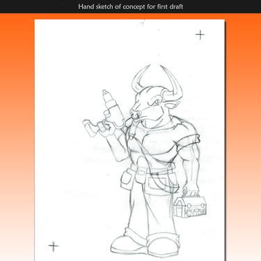
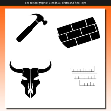
My client for this does carpentry for a living. He wanted to have his own carpentry business. He wanted not just a logo, but a mascot. He chose a bull for this. I had to practice drawing the features of a bull. He wanted me to incorporate tattoos, related to carpentry and building. This logo was to be a mascot version of himself, which was the reasoning for the tattoos-- he had tattoos as well.
The drafts illustrate the details gradually added. The cap, glasses and hair added at the end, also reflect how he typically looks at work. The version of the mascot in the black shirt, is the final version.
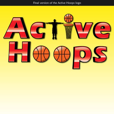
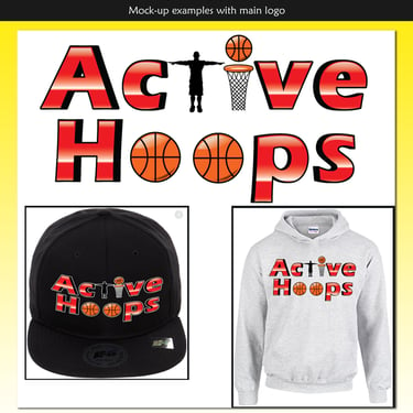
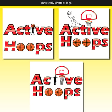
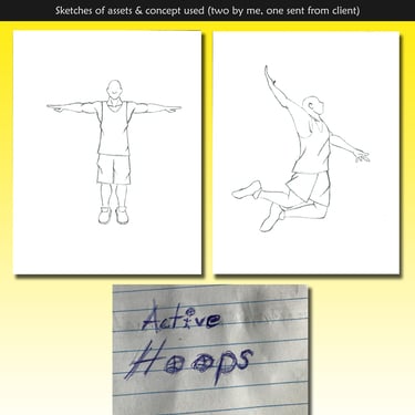
The client for this design wanted a logo for his basketball gym. It began with the idea of having a depiction of a basketball player, mid-dunk incorporated in the logo, with the alternative of having a little of a "man" with a basketball for a head. Despite the changes, having the lettering with red and white remained consistent. In one of the early drafts, I experimented with giving the text a slight perspective look. I had to use a black outline for that effect to work correctly.
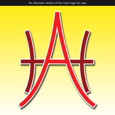
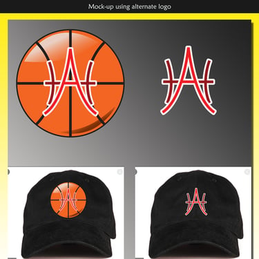
The client did approve of that and the pseudo-chrome gloss effect. He also wanted to see, how it would look on a cap or a hoodie, so I created mock-ups. The client also wanted an alternate logo, using just the "A" and "H", something that resembles the lines of a basketball. I achieved that, after a bit of experimentation. That alternate logo would serve to be used on caps, as opposed to the main logo. Mock-ups were also made for it.
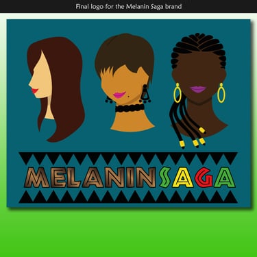
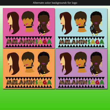
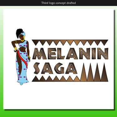
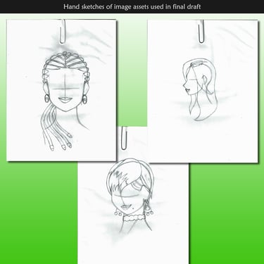
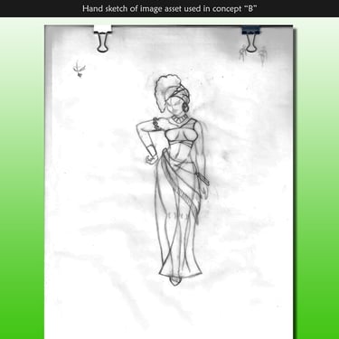
My client had began her own Afro-centric fashion line and needed a logo. While she wanted to maintain a pan African aesthetic, we did have a discussion where she expressed that she wanted more than just women of black or African to wear her clothes. This is reflected in the later drafts of the logo, that ended up being the final design. I wanted to make caricatures of women, but with different skin tones to relate to this.
The saw tooth pattern and colors I chose after a bit of research, browsing Afro-centric images to find a common theme. The final background blue color was chosen by the client.
My client for this was eager to start his own line of graphic tees. He has hired me to make designs prior this one, which I was contracted for. This was part of a collaboration between me, my client and a local illustrator. The earliest draft was the original, until the client rehired me to slightly revamp the design. The illustrator we collaborated with was also involved.
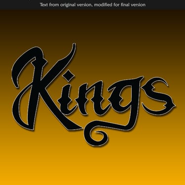
Aside from providing the text, I took it upon myself to clean up the illustration, added self-shadows to the "twins" as well as a chrome-like effect to the crowns. The separate styling of the word "king" in the revised version, was based on a reference provided by the client. The entire concept was inspired as a counter message against the general "black on black" violence that typically occurs in housing projects and low-income neighborhoods.
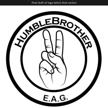
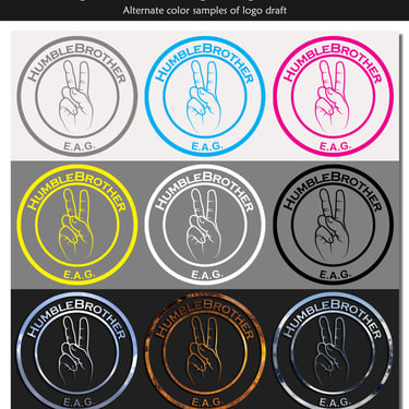
In relation to the apparel graphic of the same name and contracted from the same client: He wanted to make the moniker "Kings Don't Kill Kings" into a brand for his plans regarding graphic apparel. When he contract me to make this logo, the original name was to be "Humble Brother", as depicted by the early drafts, symbolized with the "peace" sign. While not depicted, originally the client wanted the "power fist" that has been used in many types of imagery, at the time ( i.e. social justice). I advised against this, as the symbolism of the fist goes against the idea of peace he wanted to promote, as it often symbolizes "force".
The final version was due to the client wanting to tie in the apparel graphic from a previous contract between us, by borrowing the crown from it, to use here. The Client chose the final color scheme.
Contracted projects completed for various clients

My Client for this project runs an organization, centered around helping people deal with loss and grief that comes with the death of loved ones. She needed her old logo to be retouched visualy, with new fonts for the main title and tagline.
She also requested alternate versions of the logo: a version without text, a version adjusted for social media profile use, and an icon that would appear in the browser tab, when a viewer would visit the company's website.
Roula's Kids logo rework
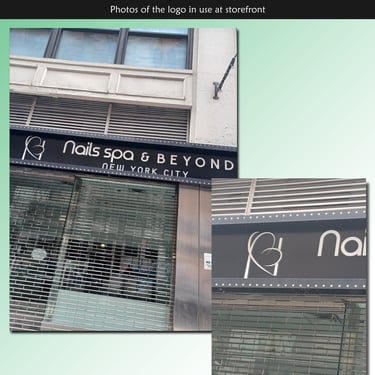
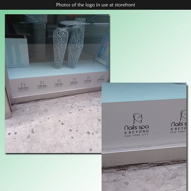
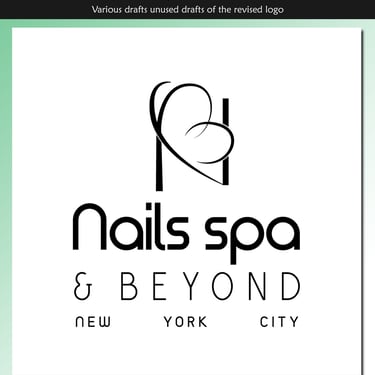
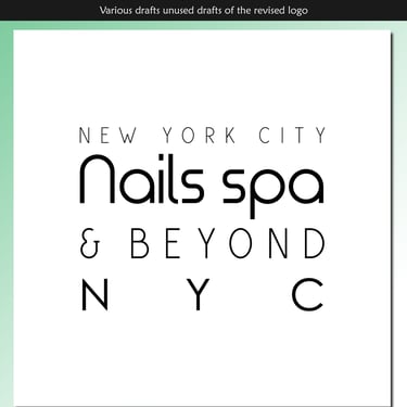
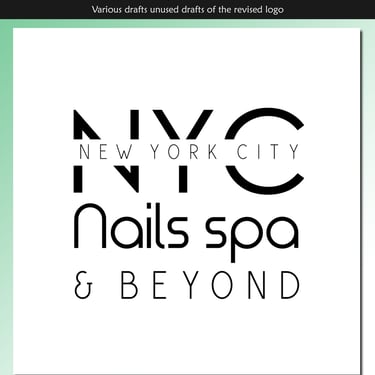
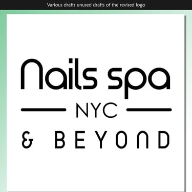
The Client's family has owned several nail salons within the tri-state area. They sought to purchase another one and in doing so, required a modification for their logo, befitting the location for the newly acquired business. I modified the logo for use at this New York City location for use with this store's outside signage and any other material pertaining to this salon.
