Exhibitions
An assortment of mockup's and ideas.
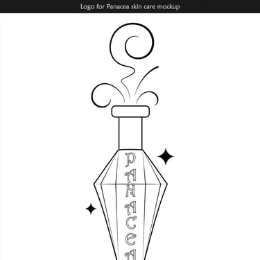
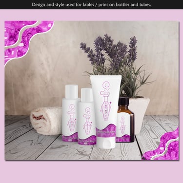
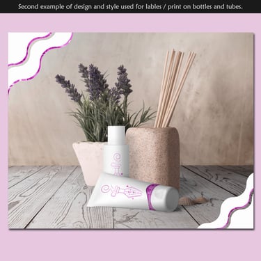
I haven't had a chance to design for beauty or cosmetics, but I wanted to have an example to demonstrate what I could do. Looking at other brands, I was at kind of a loss on what kind of faux-brand I could make. I though "Well, a lot of creams and such could be seen as 'mixtures', 'potions' or 'salves' of sorts, considering some of the jars and containers they come in". Then I though about maybe something with a "fantasy, medieval flair". That's when I settled with the potion bottle image and then name "Panacea", to frame it as a "cure".
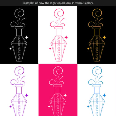
I chose the font for it because of how it fit with the fantasy-medieval theme. It seemed almost "elfish", but still readable. The tag line soon followed. For the colors, I went with a purple texture on white. I chose purple, since it is a fairly feminine color. I also imagined a sort of a "liquid metal" look, which you can see on part of the design, to also tie in the concept of "potion" or "mixture".
Candy branding & packaging mockup :
"Candy Baron"
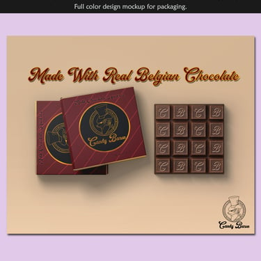
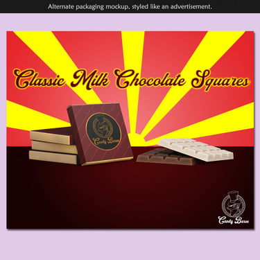
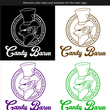
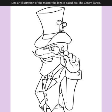
"Something a little quirky, maybe with a slight 'edge', but not taking itself too seriously . . . " was my train of thought for this branding mockup. I thought of the term "Baron" as I formulated the image in my mind. I wanted a characature; Something like an "anti-hero" version of Willy Wonka, hence the "edge" part. I used my experience with illustrations to draw a person with exaggerated features.
Thinking of what a baron would wear, I envisioned a man with slacks, a vest, dress shirt, tie and a top hat to be that signature feature of the image. To tie in the theme of "candy" I later opted to add two lollipops, sticking out the band of the baron's hat. The general features of the long jaw and mustache, was intentional for a slight "villainous" look-- anti-heroes tend to look "dark" or "villain-like", generally.
Skin care branding & mockup :
"Panacea"
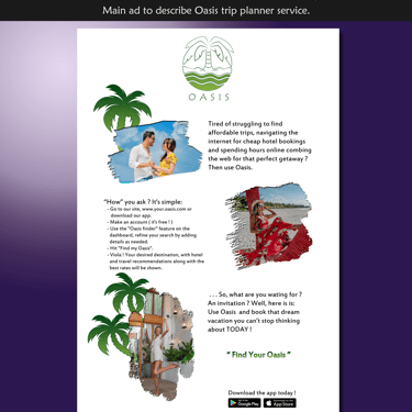
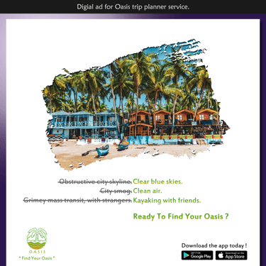
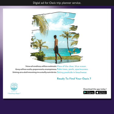
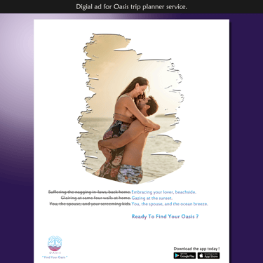
Mock-ups of a logo and digital ads for a vacation/trip planning service that promises to help users cut down on the time it takes to plan a vacation with the bonus of providing the most cheapest prices without sacrificing quality. It serves as competiton for services like "Expedia" or "Trivago", as an advanced search engine.
The Oasis brand also boasts of an app for mobile. I made this mock-up thinking about "travel" and a fairly simplistic white backdrop. The logo utilizing the imagery of a palm tree on an island, also lends to this. I was also inspired to use typography involving contrasts of negative and postive ideas people could relate to, as a means to make the idea of travel more attractive. A gimick not unlike what other services similar to this, would use in advertisements.
While the logo has no "set" color, I aimed to use "tropical-looking" colors, along with the stock photos in each ad.
( Stock photos taken by Muhammadh Saamy, Sumit Sourav, Cory Bjork, & Simona Todorova )
Trip/Vacation planner search engine service:
"Oasis"
Paperback Novel Mock-up:
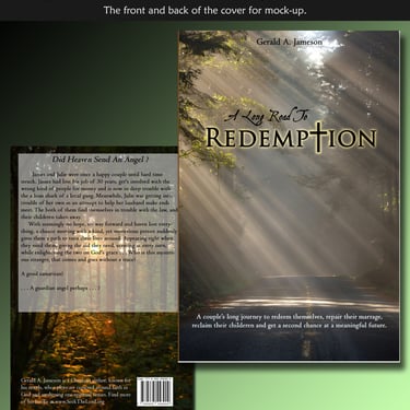
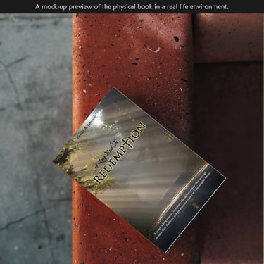
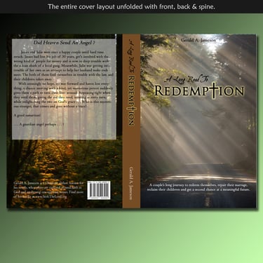
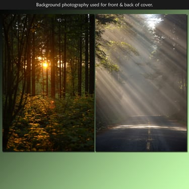
"A Long Road To Redemption"
